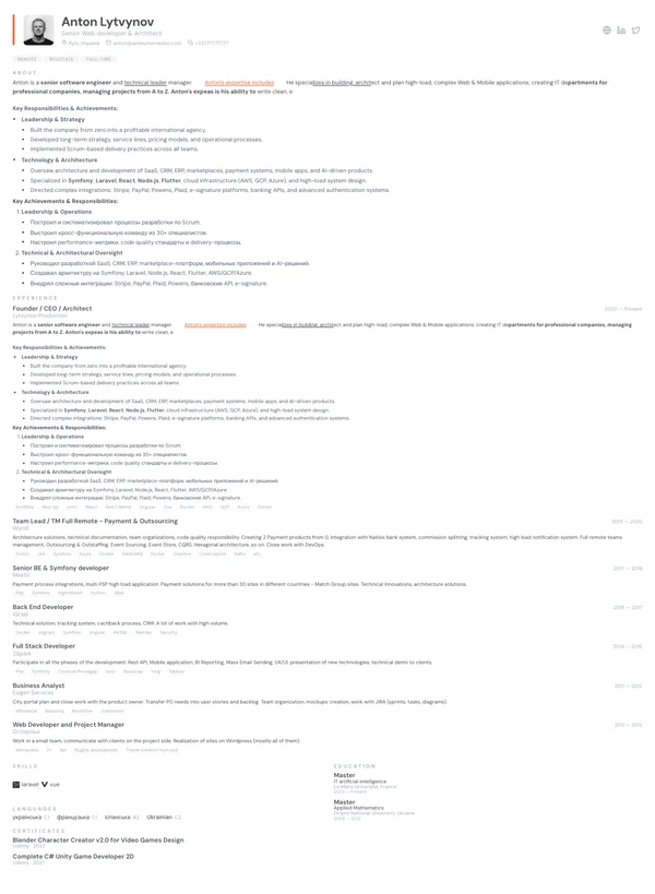
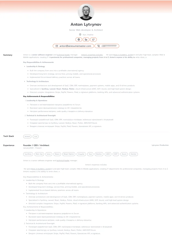
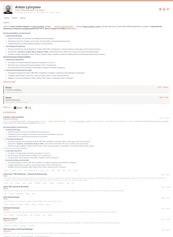
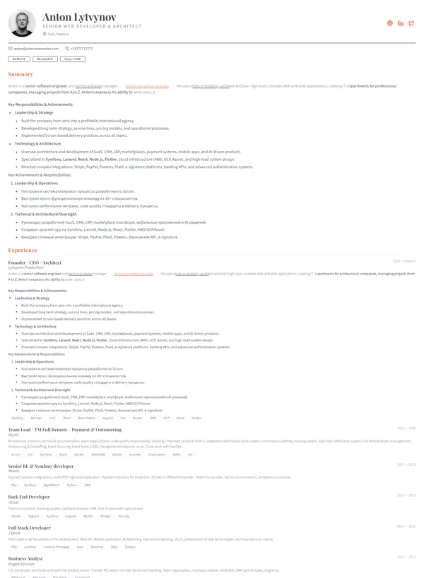
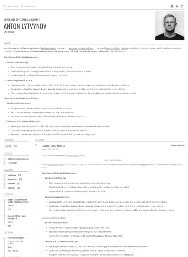
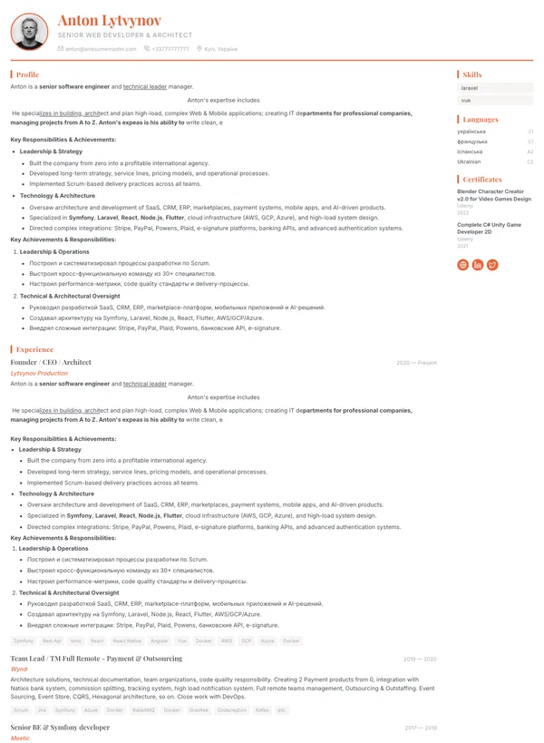
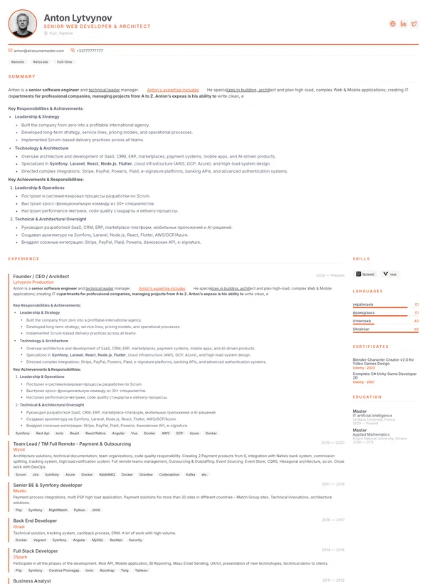
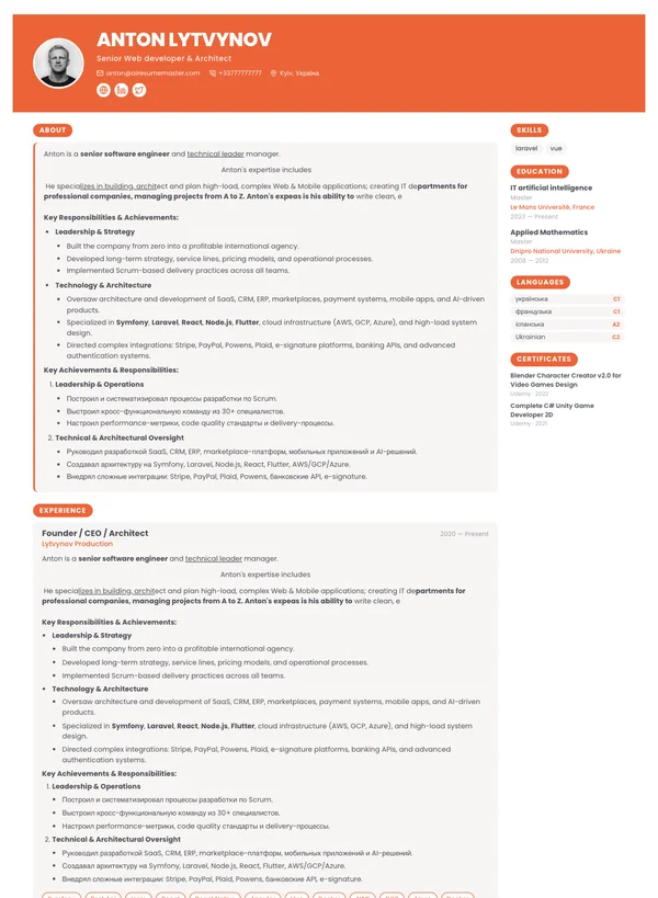
14 templates to choose from

Resume templates — see exactly how each one looks

Not an empty Word file: headings, sections, spacing and margins are already set. Pick a template, fill in your details online and download the PDF. You can switch templates whenever you like — the content stays where it is.

Decide these before you pick

  • Single column parses more reliably; two columns fit more on the page
  • Leave the photo off for US, UK, Canadian, Irish and Australian applications
  • Over ten years of experience — take a denser template, not a smaller font
  • Send a PDF unless the posting asks for Word
Pick a template and start → Free to start — no card required
How to choose

Which resume template fits your situation

Choosing a template is less about taste than about who opens the file first. At a large employer it goes through screening software before a human sees it; at a small company a person opens it straight away. That is what should decide the layout.

Applying through a job board or careers portal

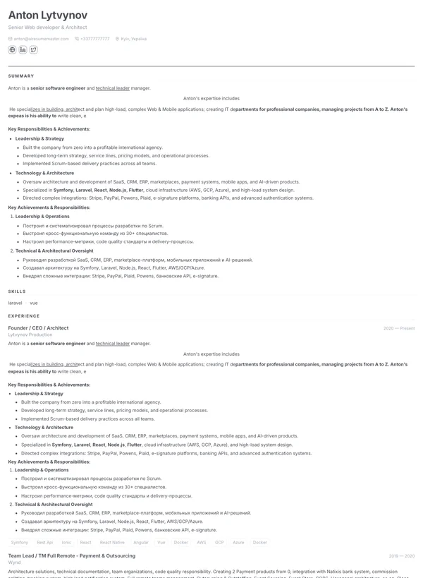
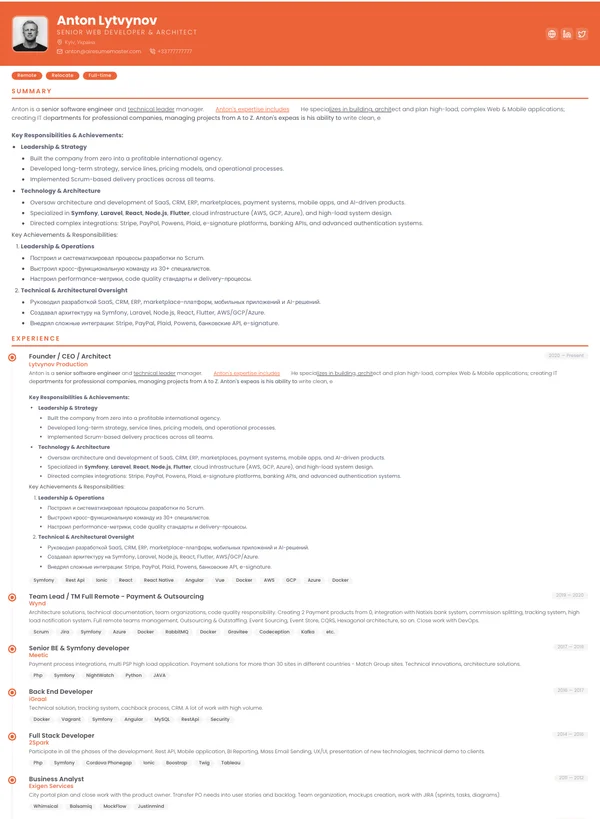
Take a single-column template with no heavy graphics — Oslo, Berlin or London. The text is then read in the right order whatever parses it.

Ten or more years of experience

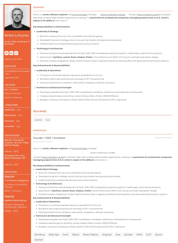
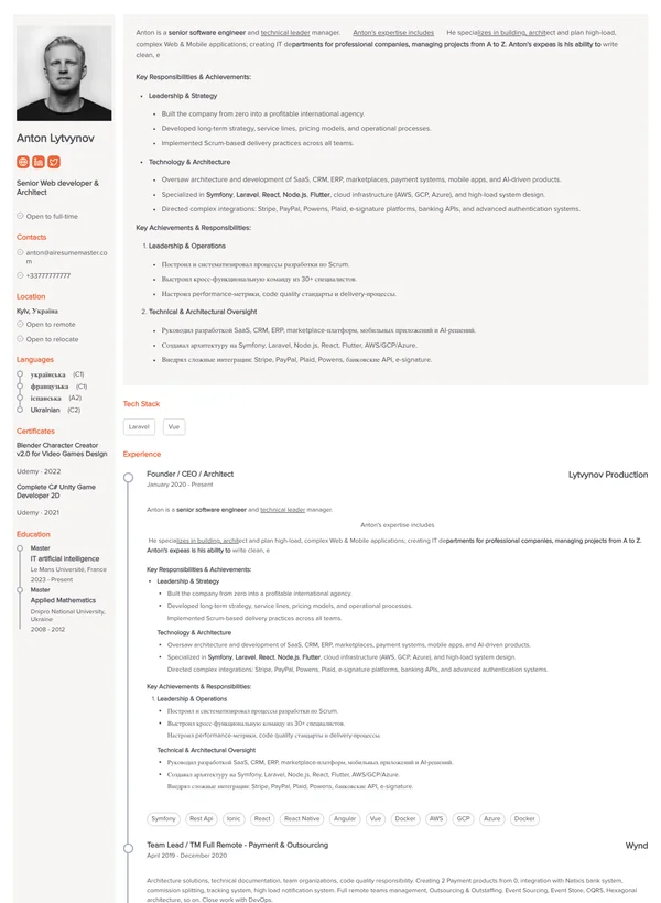
You need a dense layout or the resume spills onto a third page. Stockholm and Milan fit noticeably more text at the same font size.

First job or changing careers

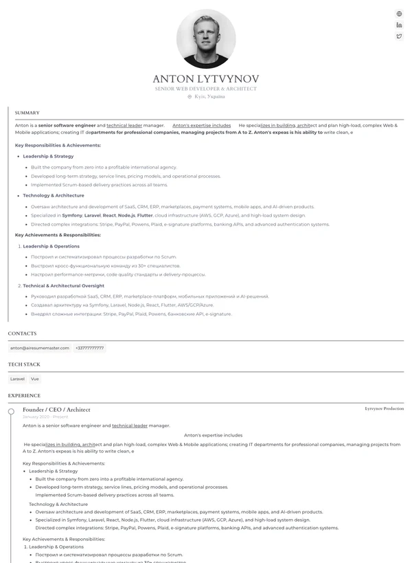
With a short history the page can look empty. London and Amsterdam carry white space well and still look deliberate rather than thin.

Design, marketing, social media

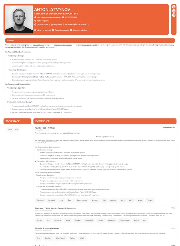
Here standing out is part of the job. Barcelona and Dubai have a visible colour block that works for creative roles and portfolios.

Tip
Keep two versions of the same resume: a plain single-column one for portal applications, and a bolder one for direct emails and referrals where a person opens the file first.
Applicant tracking systems

What makes a template unreadable to ATS

Screening software reads the file as text. Anything that is not text does not exist as far as it is concerned — which is how a beautiful template downloaded from the web can reach the recruiter as a pile of fragments, or as an empty record.

Breaks parsingText inside an image, tables used to build columns, icons standing in for section names, creative headings like "My journey" instead of "Work experience", decorative fonts, and content stuck in headers or footers.
Parses correctlyPlain text, standard section headings, a clear top-to-bottom order, dates in one consistent format, and a PDF saved without password protection.

Every template on this page is built from text rather than images, so all of them parse. If you already have a finished file and want to be sure — run it through the ATS checker: it shows you what a parser actually extracts from your resume.

Template chosen — now the words

Fill in the sections yourself, or let AI draft your experience and edit from there. The template can be swapped at any time.

FAQ

Resume templates: common questions

In the US, UK, Canada, Ireland and Australia, no. Employers there often discard resumes with photos to keep their hiring process defensible, so a headshot can cost you the application before anyone reads it. In much of continental Europe a photo is normal or expected. Pick a template to match the country you are applying in, and keep a second version if you apply in both.
A single column reads top to bottom and is parsed correctly by every applicant tracking system. Two columns fit more on the page and look more organised, but some older parsers read them in the wrong order and scramble your job history. If you are applying through a large job board or a corporate careers portal, the single-column version is the safer file to send.
PDF unless the posting says otherwise: it renders identically everywhere and nothing reflows. Send .doc or .docx only when the employer explicitly asks for it, which still happens with some recruitment agencies and public-sector applications that run files through their own formatting.
All of them are built from real text rather than images, with standard section headings, so screening software can read them. Oslo is the most conservative option: no photo, one column, typography only. If you already have a file from elsewhere, run it through our ATS checker to see what a parser actually extracts from it.
One page if you have under ten years of experience, two if you have more. A third page only makes sense for academic CVs and senior roles with a long project list. If your text does not fit, move to a denser template such as Stockholm or Milan instead of shrinking the font below readable size.
Yes, at any point. Your content is stored separately from the design, so switching templates takes one click and you see the result immediately. That makes it easy to keep a plain version for portal applications and a bolder one for direct emails.
Next

What to write in each section

The layout is handled — the content is not. Look at a finished example for your own job title, and do not skip the cover letter: an application without one looks unfinished to the people who read both.

Pick a template →